Bugs and suggestions
-
BrightLord
In regards to the unused HUD space, would it be possible to implement some sort of Action Bar system for this space?
I had a few different ideas for how this could work, but the basic idea would be to allow the player to slot something like 4-6 spells to the area. Each slot would be assigned a hotkey or something like a modifier+hotkey (Think Shift+1 or Alt+1) something like that. Pressing the hotkey could either cast the assigned spell, or set the spell to the players left or right action button. I know this is somewhat similar to the already implemented hotkey system that uses the Function keys but I have always found that system clunky and kind of foreign for how the players hands normally sit during gameplay. This would also give visual information to the players as to what spells are bound to what key at a glance, without having to open the action button menu.
I am not familiar at all with the engine or how things are structured in the programming so I'm not sure if this is feasible or even possible, but I think it would actually add value to the space instead of just trying to slap something in there simply for the sake of using it.
If this is too difficult or not possible please just disregard, but if it is possible then it may be a nice way to make use of the space
-
sergio_cannabis
- Posts: 254
- Joined: 19 Jan, 2014 14:35
BrightLord wrote:Hmm, maybe I could change the way monster data is displayed. Basically display simple name + hp bar above monster and extra data in that hud space when chat is not active.
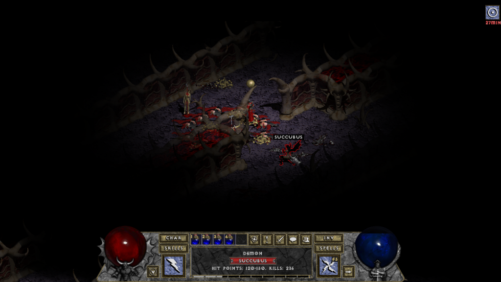
Monster name on mouse over looks just like chest / item names.
The bottom info looks kind of unclear because layers visibility in ps took out some pixels. It would be clearly visible in-game. And here is a pitch black background:
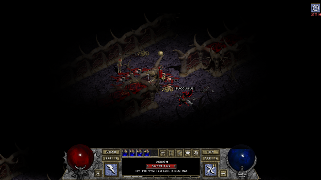
And the problem with people accidentally right-clicking their buffs to oblivion could potentially be solved (at least partially) by having those icons removed not by right clicking, but shift+left clicking. If the game needs an already existing action, that is. If it's not the case, then Shift+right click would ensure no one will ever accidentally clear his own buffs.
EDIT
Ok, I played a bit with the screenshot, how would You like something Like that Blight?
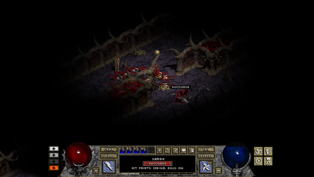
Left side - Active Elixirs indication made of edited LVL UP button, with colors matching their corresponding elixirs. Orange: magic, white: vitality, grey: strenght. black: dexterity. They can also be edited into squares instead of an rectangle.
Right Side: Class buffs. You could do 1x3, 2x2 grid, whatver. Also You'd need to resize icons for your liking, but that shouldn't be too dificult. As You can see there is no timer on either of the icons, the player would have to check time remaining by poining cursor over icon ( which would also show name of elixir / buff ).
As an alternative to timer, the buff icons could darken from bottom to top, something like this:

Stilll, I don't know whether this would be possible and wouldn't cause too much trouble.
And the problem of right-clicking one's buffs away could be solved (to an extension) by changing it to shift+left click. If the game needs already existing action that is. If not, shift+right click would solve the issue permamently.
I think the interface of Monsters Info is better now, it shouldn't be changed.
Something like time counters could be displayed maybe in upper-left corner but in same style as it is now (minutes/seconds)

also SlapZ idea is nice but with finishing of Icon Color change when skill is ready for use and maybe special hot binds (ex. Q, W, E, R)


Something like time counters could be displayed maybe in upper-left corner but in same style as it is now (minutes/seconds)

also SlapZ idea is nice but with finishing of Icon Color change when skill is ready for use and maybe special hot binds (ex. Q, W, E, R)


I don't mind buff icons being in the place they are now.riesa wrote:SlapZ, if there would be possibility to add those side icons in 800x600 resolutions with visible timecounters then it would be nice. Other way icons should be as now but non-canceled by right click.
But I see some people being displeased with their position, and Blight didn't tell whether he is ready to change them or not, so I'm playing with it. Perhaps Blight's going to like some of the options.
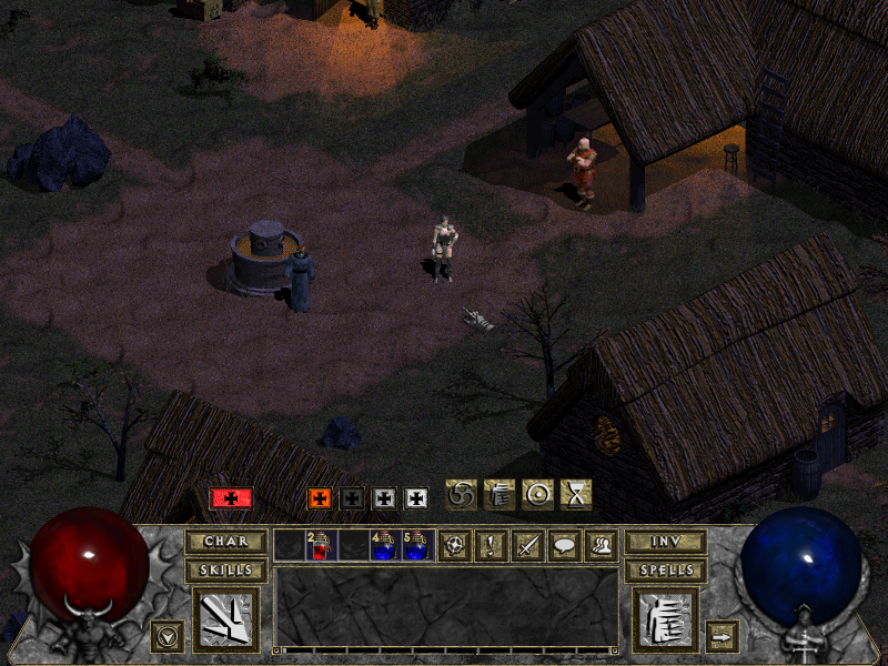
And here are single buttons:


Photobucket is getting annoying, I really need to find a better image hosting page after those 10 years.
Seriously? This issue again? I was way ahead 
Related thread here:
http://awake.diablo1.eu.org/use-dark-bo ... -t511.html
As for the elixirs buttons its a nice idea but id prefer it to be toggleable in options. I may not want some buttons to pop out on my screen after i pick up the elixir.
Same with the cooldown darkening the icon instead of the numbers timer, its possible that someone may need more detailed info about when the effect is going to end.
You put a lot of work into demonstrating ideas Slapz. Nice work.
Regarding placing buffs in the top-centre of the panel, I believe all buffs should have the same icon size. It looks strange how your elixer icons are smaller than the ability buff icons when placed together like that.

This idea is pretty cool. I would prefer the elixer icons rather than the + sign though just resized to fit whatever grid size is chosen.Left side - Active Elixirs indication made of edited LVL UP button, with colors matching their corresponding elixirs...
Right Side: Class buffs...
Regarding placing buffs in the top-centre of the panel, I believe all buffs should have the same icon size. It looks strange how your elixer icons are smaller than the ability buff icons when placed together like that.
Whether a buff relocation is considered or the current system is kept, this idea is actually really good. I think it looks nicer than the current timer based method. A top to bottom greyed cooldown effect or a circle one could be added.As an alternative to timer, the buff icons could darken from bottom to top, something like this:

Slapz demonstration of this actually looks nice and would work, however I don't see what is wrong with displaying monster info near the top of the screen. I think it looks fine the way it is now. Matter of opinion I suppose.Hmm, maybe I could change the way monster data is displayed. Basically display simple name + hp bar above monster and extra data in that hud space when chat is not active.
I need to train my memory or something.Wingard wrote:Seriously? This issue again? I was way ahead
Related thread here:
http://awake.diablo1.eu.org/use-dark-bo ... -t511.html
As for the elixirs buttons its a nice idea but id prefer it to be toggleable in options. I may not want some buttons to pop out on my screen after i pick up the elixir.(...)
And about the elixir "buttons" - those weren't made to be buttons to use elixir that would pop-up once you pick up an elixir, just a smaller, simplistic buff icon for elixirs that are working on you.
Trafił mi się raz bug z szarżą u Warriorka ale nie wiem czy da się to jakoś szybko sfixować i raczej nie jest to bardzo przeszkadzające jak ktoś gra ostrożnie jednak czasem można się wnerwić klepiąc jakiegoś bossa pół godziny i łapiąc tego buga. Chodzi o to, że jeśli za pomocą Charge będziemy się chcieli z jakiegoś ciaśniejszego pomieszczenia chcieli dostać w jakieś odległe miejsce to czasem nasz Warrior nie zdoła odnaeść drogi do tego miejsca i będzie szarżował a to raz w lewo a to raz w prawo i niestety nie znalazłem sposobu żeby go "odciąć" więc musiałem od nowa questa robić ale to akurat był nie problem 
Who is online
Users browsing this forum: Ahrefs [Bot] and 77 guests
